


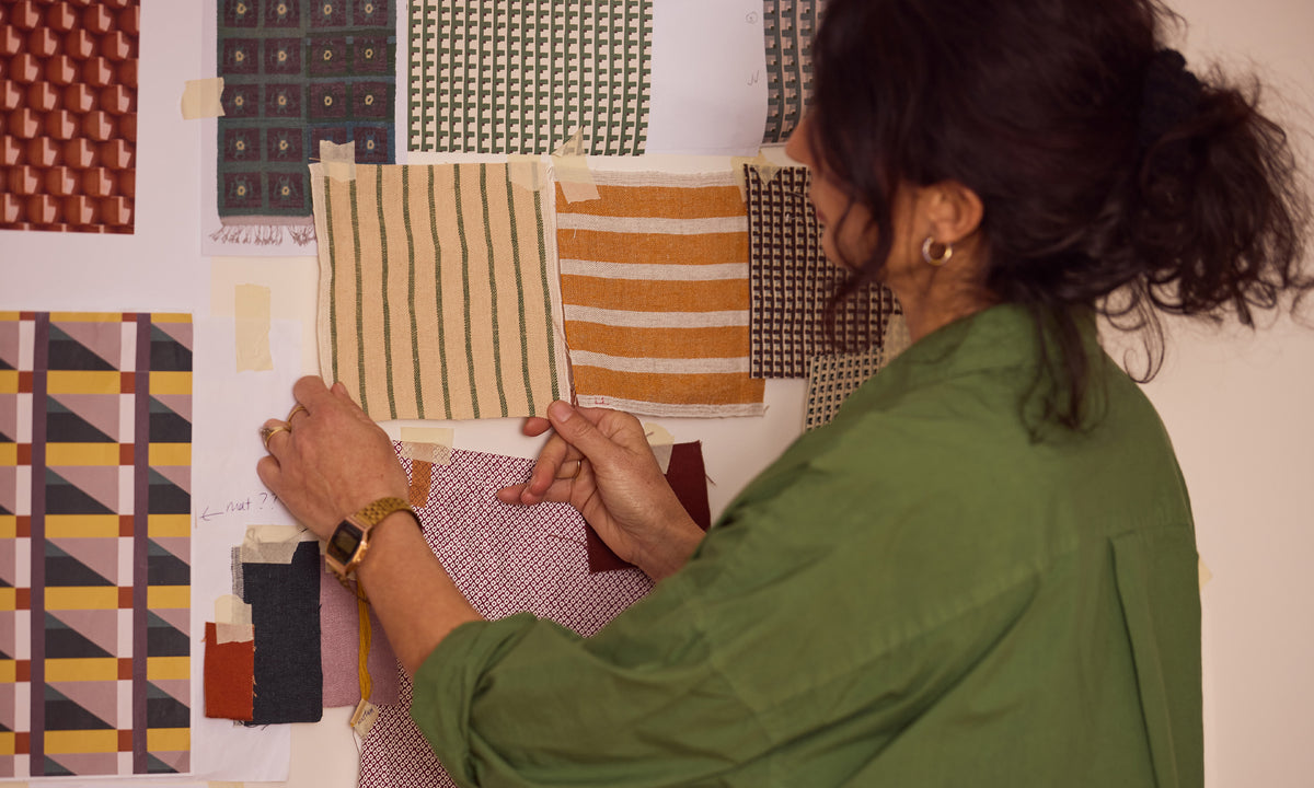
Textile designer Imogen Tunnicliffe has been an integral part of the Città design team since joining the studio in 2004. Over the years, she has helped shape Città’s distinctive design language—bringing her thoughtful and instinctive use of colour to our textile collections.
Go behind the scenes in our Auckland studio and watch Imogen share her love of colour and how it shapes her work.
In the Q&A below, Imogen talks more about her approach to colour, from building unexpected combinations to exploring the ways colour can evoke emotion.

How do you approach colour in your designs? Where do you typically begin when thinking about a colour or colour palette?
Colour is probably the part of designing and making art that I love the most. There is nothing more rewarding or satisfying than a great combination of colours. When colour, form, and texture all come together in the way you imagined, it’s very gratifying. Equally, it can be extremely frustrating when your vision doesn’t materialise.
Depending on the design, colour can either be the starting point or inspiration. A group of colours might feel nostalgic for a particular era, which can then inform the way I approach the pattern or form. Sometimes I’ll think, “How can I work these beautiful colours into a design?” In that way, colour can often kickstart the design process.
I find it very difficult to start designing anything without thinking about colour from the very beginning. To me, colour can’t be separated from the process. It is fundamental to the design—they are inextricably linked.

You’ve spoken about looking to the world around for your inspiration—landscapes, architecture, art. How does this translate into your designs?
It’s hard not to be inspired by nature in New Zealand; it feels so visually immediate for most of us. I walk a lot and I’m also a gardener, so I’m always noticing or taking photos of beautiful colour combinations, or jotting down unusual groupings I see.
For me, it’s not just the natural world, but also representations of it by New Zealand artists. I grew up in a household where we were surrounded by art, and I was particularly drawn to the landscape paintings. I think it’s something that has really stayed with me, and when I look out at a landscape, I almost see it as an artwork.
I’m also really inspired by architecture—all shapes and sizes, styles and eras are a source of inspiration, as are the objects, patterns, and textures within my home, or anywhere! I’m always looking at the relationship between one thing and another—the colour, texture, angles, and how they interact.

How do you build a harmonious palette? Do you enjoy working with unexpected colour pairings, or more tonal and complementary colours?
I love working with unexpected colour groupings. Often, I’ll start with a more expected or harmonious colour grouping, and then deliberately disrupt it, adding something in that might initially seem ‘wrong’. But because of the tonal depth, the way two colours change when they sit next to each other, or simply for some reason you can’t quite explain, it just works. It can take the whole look and feel to another level.
A good example is the Cabin Wool Blanket, where an overt use of colour is uplifting rather than overwhelming. The challenge was finding the balance between celebrating colour through a broad palette, and combining the colours in a way that didn’t tip the design into a confused cacophony. It worked, and it is still one of my favourite designs in the Città collection.

What role does colour play beyond aesthetics? What can it evoke or communicate?
Colour has the ability to communicate really powerfully and can elicit a strong emotional response—positively, or negatively! Our personal experiences can change the way we react to colours. There might be a colour that reminds you of your old school uniform, for example, and you can’t disassociate it from that period of your life.
In terms of an emotional response, I always think of the Rothko Room at the Tate Modern. The colour use is quite overwhelming, and everyone responds to it slightly differently. It creates a space for your imagination to go wherever it wants, and for each person, that experience is a little different.
I love it when colour brings people real joy. You can see it in their faces when the combination of colours surprises them in an unexpected way. And it doesn’t always have to be bright, either; some of the combinations people react to are often quite subtle, earthy or pale.